Showing posts with label exhibitions. Show all posts

Saturday, 14 May 2011

András Baranyai: Hero Recycle


One A Day had a little Q&A session with András Baranyai back in January after spotting his incredible serigraph prints at the Printa Gallery. Since then, the Debrecen born artist has been busy getting lost in his own crazy little world to create a new series of work for his latest solo exhibition.


The exhibition, titled Hero Recycle, features a new series of work including stencil-graphics and acrylic on board alongside some of his more familiar pieces - all of which showcase András' trademark
retro-futuristic, sci-fi aesthetic.


The Roham Galéria, which hosts the exhibition, has just celebrated it's one year anniversary and it only seemed fitting that András (who has collaborated with Roham for their illustration/visual arts magazine on numerous occasions) would be involved. 


Hero Recycle
Roham Galéria
Vas utca 16. 8 .ker.
Budapest, Hungary
Runs until the 5th of June.

Wednesday, 4 May 2011

Under the Damp Earth - Stuart Kolakovic


Independent publishers Nobrow are unveiling their newly extended gallery space this week and have an exciting inaugural exhibition prepared! The premier show, titled Under The Damp Earth will feature the work of one Nobrow's most celebrated illustrators: Stuart Kolakovic.

Stuart's work is instantly recognisable and highly successful, with past clients including Ted Baker, Marks and Spencer and various international publications. However, Under The Damp Earth sees Stuart take a departure from his usual commercial style to focus on creating a series of much darker imagery. 
Currently based in the Midlands, the Kingston University graduate is an illustrator in the most traditional sense, relying heavily on hand rendered techniques to produce his beautifully realised images. His rich illustrations have a distinctive eastern european folk art aesthetic which he draws from his own Serbian family roots.

Stuart's exploration of his Eastern European heritage lead to him being awarded the D&AD New Blood Award for his graphic novel Milorad. The 80 page book revolves around Stuart's relationship with his grandfather and the influence he had on his life.

The pieces which are going on show for Under The Damp Earth have been kept tightly under wraps so make sure to pop along for the grand unveiling!

Under The Damp Earth
Open 5th May - 23rd June
62 Great Eastern Street, EC2A 3QR, London, United Kingdom
http://stuartkolakovic.co.uk/

Friday, 11 March 2011

Mosaic: John Goto at the Edinburgh Printmakers


We love John Goto's abstract images inspired by the invasion of the Gaza Strip by the Israeli Defense Force. Goto explores the juxtaposition of traditional printing techniques with digital image manipulation. In the case of Mosaic, Goto takes documentary images taken during the Gaza conflicts and pixilates them using a geometric mosaic motif.


The application of this motif connotes the kind of censored images we see in the media (usually blocking out a criminal's face or exposed genitalia), voicing Goto's strong criticisms of the way the international press was denied access to the conflict.


Goto has exhibited at Tate Britain and the National Portrait Gallery and is currently Professor of Fine Art at the University of Derby.

Mosaic: John Goto runs until the 19th March 2011 at the Edinburgh Printmakers Gallery.

Sunday, 27 February 2011

Ádám Dallos @ BumBum

Last Thursday we popped along to BumBum for the opening of 24 year old Hungarian University of Fine Arts graduate Ádám Dallos' first ever solo exhibition. The young artist explores the themes of gentleness and strength through a mixture of homo-erotic imagery and paintings of wild animals set against an unrealistic baby-pink background.


There is a real sincerity in Ádám's work which is endearing. Some of the male couples depicted in his paintings connect tenderly with each other and with the viewer, often meeting and holding our gaze as they stare out from the canvas. 


While 'gay' subject matter may not raise too many eyebrows in the West, it is still considered a bit of a taboo in Central-Eastern Europe. Therefore, we at One A Day applaud Ádám for being so forthright about the subject of same-sex relationships and we hope to see more 'queer art' making its way to the mainstream in Hungary.


For more on Ádám Dallos head over to his official website

Monday, 14 February 2011

Zsuzsi Csiszér @ Art Blokk


We first became aware of Zsuzsi Csiszér’s work at Budapest’s annual Art Fair at the Műcsarnok whilst reporting for Artsthread.com.  Her poignant, foto-realistic, faux-collage paintings have quickly made her one of our favourite contemporary female artists. Zsuzsi is currently exhibiting at the Art Blokk gallery in the Corvin centre and we went along to take a look...


The exhibition develops the same themes which Zsuzsi has been exploring for the past few years such as the pressures faced by 21st century women and the way femininity is portrayed and condemned by mass media. In one series of claustrophobic portraits, Zsuzsi traps her subjects in an extreme close-up, their faces ‘slashed’ through a technique of layered oil paints which imitate rips and tears in the canvas. Others are suffocated beneath plastic, their beauty commodified and preserved like a piece of expensive furniture. There is a blatantly violent overtone to these portraits which, at times, is quite unnerving...


While these portraits seem to deal with the trappings of beauty, Zsuzsi's other painted collages such as Mother Curtain and Why Not? deal with other pressing issues faced by women today. Mother Curtain hints at pressures of marriage (specifically arranged marriages), while Why Not? suggests the inner conflicts of a woman facing peer pressure over sex, cigarettes and other vices.


Larger pieces such as There Are People Who Like This and You Have to Know What is the Topic of This Picture are a barrage of mixed media imagery and slogans erupting in a glamorous, explosive mess. The images are instantaneous, they grab your attention and draw you in with their vivid colours and suggestive subject matter.  However, take a closer look and you will spot some hidden details - motifs of teddy bears and ducklings, revealing the lost innocence of the women who have fallen victim to the trappings of mass media culture.

Friday, 11 February 2011

In Movement: Inauguration of the new Spiritusz Galéria


The Spiritusz Galéria has moved! Previously located on the Pest side of Budapest, the contemporary art space has packed its bags and settled into the previous exhibition hall of its ‘mother institution’ the Várfok Galéria. In celebration of the gallery’s evolution, 13 contemporary artists from the fields of photography, sculpture, painting and video art have been asked to produce a piece exploring the theme of ‘movement’.

You can learn more about the exhibition by clicking HERE
or read my previous review of the Spiritusz Galéria @ Budapest Art Fair  HERE

Wednesday, 9 February 2011

Reefs of Noise: László Mulasics


Reefs of Noise is the premier exhibition of the new and improved Várfok Galéria. Celebrating the life and works of the painter László Mulasics (1954-2001), Reefs of Noise showcases a selection of his purest paintings from, arguably, his most important creative period.

László emerged from Hungary's New Sensibility movement in the 1980’s as a figurative painter creating sensual and mysterious works awash with expressive colours. But, by the mid 80’s Laszlo put down his paint brush and began experimenting with bee’s wax. This was a long experimental period for László as the encaustic technique is notorious for being one of the most difficult mediums to master.  However, László's passion for his materials led him to discover new ways to manipulate and control the wax, making him one of a very small, niche group of creatives who can truly call themselves ‘encaustic artists’.

 Locked Stadium
1988 encaustic, lead, bronze sieve, wood on wood panel 

During this period László also shunned his colourful palette in favour of a darker aesthetic.  “While the majority of Mulasics’ work from the mid 80’s and early 90s was incredibly dark and contained a lot of black, we should be careful not to label it his ‘Black Period’ but rather his  ‘Colour Minimal’ period,” explains Varfok’s resident art historian Kriszti Kovács.  “His quiet approach to colour does mean his paintings are melancholic but they are also very meditative.”

Indeed, László Mulasics’ work has a certain meditative aura about it - his strong painted gestures have a mysterious and ambiguous quality to them which perhaps they would not have had were he to have worked with a more vibrant colour scheme. The ambiguity of Mulasics' work can be attributed to his keen interest in nature, scientific discoveries and the cosmos.


 Constellation

1996, encaustic, oil, enamel, canvas

Motifs re-occur in several of his pieces such as the dog, horse and the figure at Hang Csou bay. Most of  these  motifs were taken from antique books which Mulasics enjoyed collecting - if only for the diagrams and illustrations contained within. The cabinet at the back of the Várfok is dedicated to some of the motifs Mulasics was so fond of. These never before seen mixed media pieces present the motifs in copper ink within a bold geometric frame.


 Interferences

1998, encaustic, oil, enamel, canvas
What is most striking about the work of László Mylasics is the sheer scale of his work. When one takes into consideration the skill required to create such enormous pieces using  a technique as tricky as encaustic then our admiration towards this incredibly talented artist grows.
 
“His pieces are so large that they require a lot of space in order for us to truly appreciate them,” Kriszti smiles, “But I think our new gallery does him justice.” 


Untitled - 099 & 104

1997, encaustic, ink, copper, oil on paper

For more information about the exhibition, head over to the Várfok website 

Monday, 18 October 2010

Thursday, 30 September 2010

Seven Stations


Predrag Todorovi is currently exhibiting 38 of his works at the Zikkurat Gallery in Budapest.

Using a variety of techniques and materials such as coal, slate, wax and pen, Todorovi creates swirling, vortical structures of light and dark. Not content with drawing on flat surfaces, Todorovi also scratches, engraves and embellishes common objects such as a knife, pipe and loaf of bread with his distinctive patterns.

Amongst the 38 pieces on display are a few new works created specifically for the exhibition. Drawing inspiration from the Zikkurat, Todorovi has forged a unique partnership between his work and the gallery space.

"Zikkurat is, symbolically, a meeting place of the human the timeless," explains Todorovi. "The Zikkurat Gallery has seven rooms at sevel levels, which is not a coincidence. My intention was to transmit the symbolism of the possible ascent in human life from the primary material level... up to the seventh level - eternal life."


Seven Stations
Zikkurat Gallery, Budapest from the 19th September to 26th November 2010.

Wednesday, 29 September 2010

The Pleasure Of Light


The Pleasure of Light exhibition introduces the work of two interdisciplinary artists:  Györges Kepes (1906 - 2001) and the Frank J Malina (1912 - 1981).

Working at the intersection between art, science and technology, the two artists produce work which explore the themes of light and movement through hypnotic kinetic paintings, neon installations and exquisite black and white photography.

"The exhibition is less a chronological show of art works than an attempt to map the interdisciplinary tactical approach by two remarkable people. their notions, their works, sphere of inspiration and lasting heritage."

While the lines between disciplines are increasingly blurred in 21st century contemporary art, it was considered pioneering for these two creatives to be applying their obtained military knowledge of science to their artistic projects.

The Pleasure of Light is on at the Ludwig Museum, Budapest from September the 3rd to November the 21st.

Wednesday, 22 September 2010

Prints Of Darkness


The record cover has been an artform in its own right ever since the first long-playing phonograph record was produced in 1931. While Beethoven's Fifth Symphony may not have been a prime example of cutting edge graphic design, the possibility for experimentation was evident right from the beginning. Over the past 80 years we have seen this genre of visual art develop a bewildering range of sub genres each packed with their own micro histories.

However, since the introduction of file sharing, the mp3 and i-tunes,  the quality of artwork has diminished. As there is no longer a tangible element to music - no packaging, no inserts containing lyrics, no physical ownership - the album cover is now merely an afterthought, hastily put together with little or no concept before being slapped online.


Back in the 'old days' the packaging played a huge part in the way we consumed music. While we were always told never to judge a book by it's cover, this was never the case when it came to LPs. In fact, you ALWAYS judged the album by its sleeve and nine out of ten times, you were never disappointed.

As the formats shrunk from vinyl to CD to mini-disk and then to mp3 the ability for the album cover art to shock or entice us has become more difficult. Marilyn Manson's Mechanical Animals or The Rolling Stones' Sticky Fingers  would never have caused as much controversy as they did had they been a 75 x 75 pixel thumbnail on the i-tunes homepage.


While record sales may have fallen dramatically, they still bare a strong visual presence as an iconic object or artefact. Records are now being produced for a niche market and are treated as collectable items with hand-made covers on the increase. It is this current resurgence which has inspired Prints of Darkness.


Curated by Sarah Manning Cordwell, Norman Shaw and Edward Summerton, Prints of Darkness contains over a dozen pieces produced by 11 Scottish artists, each exploring the theme of record cover art. The show contains a healthy mixture of illustrative, photographic and typographic designs each one recalling the golden age of the record cover during the 'post-psychedelia, goth-surrealistic, Art Nouveau, apocalyptic landscape explosion'  of the 1960's and '70's.

Norman Shaw channels Salvador Dali in his surreal landscape Princess of Darkness while Mark Wallace borrows from Pop Art to produce Lordin' It.  Sinister looking crows and intricate spider webs  are the subject matter for Edward Summerton and The Lonely Piper and cats are victimised by Andrew Cranston and Malcy Duff.


The dark imagery and twisted sense of humour which runs throughout the exhibition is continued in This is Light Music, an exclusive full-length picture-disc album produced exclusively for the exhibition. Created by award-winning international multimedia artist Vicki Bennett, the disc/audio installation explores the themes of darkness and joy and the irony of subverted 'light music' in popular culture.

In addition to the original pieces on display, the exhibition concludes with an installation of influential and inspirational vinyl album covers selected by the exhibiting artists. Iconic LPs such as Kate Bush's Never for Ever, the Sex Pistols'  Never Mind the Bollocks plus Led Zeppelin and Black Sabbath's self titled debuts are amongst the selection - proof that while the devil may not have all the best tunes, he certainly has the best album covers.

Friday, 6 August 2010

Roman Cieślewicz Retrospective @ RCA


The RCA is showing a major retrospective exhibition of work by the extraordinary Roman Cieślewicz. An extremely significant designer in Eastern Europe and France, Cieślewicz has strangely had little attention in the UK. Curated by David Crowley, Andrzej Klimowksi, Jeff Willis and Anna Grabowska-Konwent, the exhibition features a broad cross section of work from the 1950's right through to the end of his life in 1996.

Curated in chronological order, the show begins with a significant selection of Cieślewicz' poster work produced during his time in Soviet Poland circa 1955.


"Producing work in Soviet Communist Poland during a period where there was no commercial pressure resulted in a surprising amount of artistic freedom," explains David Crowley, curator and Head of Department of Critical Writing at the RCA. Given our preconceptions of Communism, it's surprising to hear that there was much room for artistic expression in a totalitarian government. Yet it is clearly evident when we view the examples of Cieślewicz' early poster work that he was given the freedom to openly reject the conventional design clichés of that period: in the East there was the Soviet Communist propaganda and in the West, Hollywood posters where the star of the film was the driving force behind the promotion.

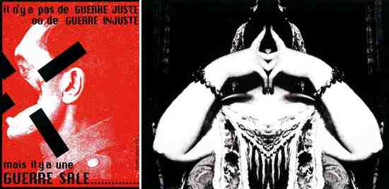
For his theatre and cinema poster designs, Cieślewicz combined reproduced images from the media with painterly fine art techniques, often hand-painting the typography. Poster designs on display such as his designs for Katastrofa, Nafta and Vertigo are perfect examples of his juxtaposition of minimalist photo-montage and painting, all of which hint towards strong Surrealist influences.


There is a lot of evidence throughout the exhibition which shows that Cieślewicz's self-initiated work regularly informed his commissioned pieces - particularly his experiments with photomontage. Cieślewicz commands a very minimalist approach to collage

"By the 60s, surrealism was pretty much bankrupt in the Western art scene, yet it thrived in Eastern Europe," explains co-curator and RCA Professor of Illustration Andrzej Klimowski. "The core vocabulary of surrealism thrived and expanded. Lots of ambiguous images are played out by Cieślewicz and we chose many images which play out these surrealist games."

But why was Surrealism so potent?

"Surrealism was almost realism at that time in Eastern Europe," reminisces Klimowski. "You would go around the shops and there would be nothing in them. You would visit a a shoe shop and inside there would be one box with a single heel inside. Life was absurd so surrealism was the perfect vehicle to express that period."

As the exhibition progresses and we approach his work from the 1970's we witness how life turns from the absurd into something much darker. The main body of work from this period was produced while Cieślewicz' wife was dying of cancer and by looking at these pieces you get a real sense of the tragedy which was playing out. The mirky, inky darkness of Bloomusalem and Diably z Loudun (1974) testify to the torment Cieślewicz was suffering in his personal life. The images are dark, brooding and often unsettling, highlighting Cieślewicz's clever understanding of the capacity of an image to provoke and upset people.


Working with lines of symmetry Cieślewicz composed mirror images reminiscent of Rorschach ink-blot tests. Bodies form frightening, headless shadows, other's become grotesque amputees or cycloptic demons. Many of these experiments in mirror imagery have been reworked into designs for magazines and posters; the Wiestaw (1971) screenprint can be seen to directly inform the Sprawa Dantora theatre poster produced 3 years later.

A broad range of editorial and book designs add further dimensions to the exhibition, giving us a broader insight to Cieślewicz' working practise. Highlights included his series of 26 designs for Ann Radcliffe's The Mysteries of Udolpho, for which Cieślewicz combined details from old Renaissance master paintings alongside imagery from glossy magazines to create a contemporary response to the gothic romance novel.


Another highlight was the third and final issue of Kamikaze, published posthumously in 1997. Filled with strikingly stark reproductions of black and white images from the media juxtaposed with laconic captions. The real highlight, however, was the issue of Ty I Ja on display. Essentially a women's magazine, Ty I Ja was produced entirely out of recycled materials with the majority of the layout being created using a simple cut and paste technique, appearing almost like a scrap-book.

Running consistently throughout, the Roman Cieślewicz exhibition highlighted work which continued along the artist's pre-occupation with the themes dignity and the individual. We see his double life, working as a commissioned designer for the likes of Elle and as an independent, producing startling work under his own steam. Most importantly, we witness how his personal, self-initiated work informs his commissioned pieces and how he turns tragedy in his personal life into extraordinary art.

Article published by ARTS thread